


How to Build a Responsive Website with HTML, CSS, and JavaScript

Table of Contents
One of the must-have requirements for a modern website would be a responsive website. You will definitely need to have mastery over HTML, CSS, and JavaScript to create a responsive website. In this guide, we will explain how to build a basic responsive website from scratch. This guide covers some basic coding examples and tries to help you understand their real or practical applications.
Introduction To HTML, CSS, and JavaScript
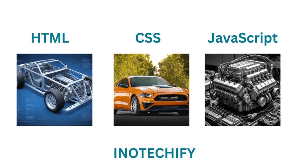
Before learning responsive design, the simple functions of HTML, CSS, and JavaScript should be known. These three languages work together in order to provide structure, style, and interactivity to a Web page.
HTML (Hypertext Markup Language)
HTML stands for hypertext markup language used in creating the structure of web pages. It defines elements such as headings, paragraphs, links, images, and many other elements. A simple example of the structure in HTML is as follows:
<!DOCTYPE html>
<html lang="en">
<head>
    <meta charset="UTF-8">
    <meta name="viewport" content="width=device-width, initial-scale=1.0">
    <title>Basic HTML Structure</title>
</head>
<body>
    <h1>Welcome to My Website</h1>
    <p>This is a paragraph of text.</p>
</body>
</html>
In this example, HTML defines the document’s structure, including the title and content.
CSS (Cascading Style Sheets)
CSS stands for Cascading Style Sheets, and it is a language used to set the appearance of HTML elements. The user interface view works through layout, colors, fonts, and spacing. The code above was an HTML; here is how you can style that HTML structure:
body {
    font-family: Arial, sans-serif;
    background-color: #f0f0f0;
    color: #333;
    text-align: center;
}

h1 {
    color: #2c3e50;
}

p {
    font-size: 18px;
}
CSS allows you to apply consistent styles across your entire website, making it look attractive and professional and it plays an important role in making a website responsive. Once you master the CSS you become a master of designing a website.
JavaScript
JavaScript is the programming language that gives interactivity to your website. It can modify HTML and CSS dynamically and also dynamically produce content based on user actions, improving the user experience. Here’s a very simple piece of JavaScript code if you need an alert to pop up whenever someone clicks a button:
function showAlert() {
    alert("Button clicked!");
}
This JavaScript function can be connected to a button in your HTML, making your website interactive.
Understanding Responsive Web Design
Responsive web design is an approach by which web pages are developed to use with good ease, and the components of the page automatically resize and hide to meet screen size and orientation requirements. In this way, it creates a great user experience on any device, It can be a desktop, tablet, or smartphone.
Today, one uses many devices to connect to websites. A responsive website is not only good in terms of user experience. A responsive design helps in rankings, so it is important to have both when developing any modern website.
Setting Up the Project Environment
Before getting into the code, we need to set up a good project environment. The reason is simple: this way, you will avoid code mess and common problems that usually arise with a growing project. So, here is how to set up your project environment properly:
Choose a Code Editor:
The first thing you’ll do in your environment is choose a good code editor. Code editors are software offering an interface to write and edit code. The following are among the most commonly used editors by developers:
Visual Studio Code
Visual Studio Code is designed by Microsoft and it is an extremely powerful IDE that provides developers with a large library of extensions it is very easy to use as well as very light in memory consuming of your PC thus it will bring productivity and efficiency while creating a responsive website or developing.
Sublime Text
Sublime Text is also a powerful IDE it is known for it is fast speed and simplicity, This software offers developers a clean and distraction-free UI thus making it a good editor for developing
Atom
Lastly, Atom is also a popular code editor among the developers providing a good UI and with customizable option for UI. This software was developed by GitHub and it has an excellent community and a range of plugins.
Each of these editors has unique features, so choose one that fits your workflow and preferences.
Creating a Project Structure
The project structure plays an important role in the development and further modification of the required file. The first thing that needs to be done is to make a separate project folder. Inside this folder, you should have separate files for each component of your project:
index.html
index.html is a standard or extension for saving an HTML file suppose you have an HTML code and you wanna save it when you save your file it will automatically add an extension of .html with that file which indicates to the browser that it is an HTML file. HTML code is a structure of your website without that code your website would not be rendered on the browser. In the index.html file index is the name of your file and .html is an extension that tells the browser that this contains an HTML code.
style.css
Similarly, In the style.css file style is the name of your CSS(Cascading Style Sheet) and .css is the extension that tells the browser that it is a CSS file and it is responsible for the appearance of your website.
script.js
As the name says this file contains the JavaScript code of your website .js is the extension of the JS code and script is the name of your JavaScript file. This file is responsible for adding dynamic features or increasing interaction by including events on your site.
Optionally, you can create subfolders such as css, js, and images to keep related files organized, especially as your project grows.
Linking HTML, CSS, and JavaScript
Now, you want to make your website functional and beautiful. The HTML file has to link with the CSS and JavaScript files for it to work properly in the browser. Here is how you can do this:
Linking CSS
In the <head> section of your HTML file, use the <link> tag to connect your CSS file:
<head>
    <link rel="stylesheet" href="style.css">
</head>
This tag tells the browser to apply the styles defined in style.css to the HTML document.
Linking JavaScript
Place your JavaScript file link just before the closing </body> tag in your HTML file using the <script> tag:
<body>
    <!-- Your content here -->
    <script src="script.js"></script>
</body>
These steps will help you set up a proper project environment so that your code is clean, well-organized, and easy to manage. More importantly, it applies a strong base for how you are going to build bigger and dynamic websites.
Building the HTML Structure
HTML is the structure of your website. It defines the content and the layout that your pages will have. The basic structure is created like this:
<header>
<nav>
<ul>
<li><a href="#home">Home</a></li>
<li><a href="#about">About</a></li>
<li><a href="#contact">Contact</a></li>
</ul>
</nav>
</header>
<main>
<section id="home">
<h2>Home Section</h2>
<p>This is the home section of our responsive website.</p>
</section>
<section id="about">
<h2>About Us</h2>
<p>Learn more about our mission and values.</p>
</section>
<section id="contact">
<h2>Contact Us</h2>
<p>Get in touch with us for more information.</p>
</section>
</main>
<footer>
<p>© 2024 Responsive Website | InoTechify</p>
</footer>
This structure uses semantic HTML elements like <header>, <main>, <section>, and <footer> to organize content meaningfully.
Styling the Website with CSS
It’s impossible to make a responsive website without CSS (Cascading Style Sheets). It is the tool for your website on how it should look, how it’s supposed to appear, and how it will be laid out so it will be useful to people visiting with a variety of devices. Let’s dive a bit deeper into exactly how CSS works with responsiveness and what methods to apply so that your website fits the different dimensions of screens.
Understanding the Box Model
You really do need to know the CSS box model inside out before you begin styling elements. You could say that any HTML element on your webpage can be treated like a box. The box model of an element is defined by the content, padding, border, and margin. Figuring out how you can use the box model effectively will give you great control over the spacing and layout of elements on different devices.
- Content: The actual content of the element (text, images, etc.)
- Padding: The space between the content and the border.
- Border: The edge surrounding the padding (or content if padding is not specified).
- Margin: The space outside the border, separating the element from others.
element {
  margin: 10px;
  padding: 15px;
  border: 1px solid #000;
}
This makes it possible to control the spacing between the elements as the screen size changes.
Media Queries
Media Queries play a crucial role in website responsiveness through CSS. Media queries allow you to apply specific styles on your website based on different characteristics like device resolution, width or height, etc.
For example, to change the layout for tablets, you might use:
@media (max-width: 768px) {
  .container {
    flex-direction: column;
  }
}
This query checks if the device width is 768 pixels or less, common on tablets, applying the styles within. For example, it will change a flexbox layout from row to column.
Flexible Layouts with Flexbox and Grid
Flexbox and Grid are two CSS layout models that provide the capability of creating flexible and responsive layouts.
Flexbox
Useful for creating one-dimensional layouts, either a row or a column. It’s extremely useful for aligning items and distributing space within a container, even when their size is unknown or dynamic.
.container {
  display: flex;
  justify-content: space-between;
  align-items: center;
}
Grid
Best for two-dimensional layouts. Using CSS Grid, you can create complex layouts with the help of rows and columns and align items perfectly.
.grid-container {
  display: grid;
  grid-template-columns: repeat(auto-fill, minmax(100px, 1fr));
  gap: 10px;
}
It is the property of both Flexbox and Grid that changes the layout according to the size of the container, thus It will ensure a responsive website design.
Responsive Typography
Responsive typography means that text is scaled well—also on mobile devices. It can be controlled by relative units like em, rem, or percentages, not fixed measurements like pixels.
body {
  font-size: 1rem; /* 16px by default, scales with user settings */
}

h1 {
  font-size: 2.5em; /* 2.5 times the size of the parent element's font size */
}
Additionally, you can use media queries to adjust font sizes based on screen width:
@media (max-width: 600px) {
  body {
    font-size: 0.875rem; /* Slightly smaller text on small screens */
  }
}
Fluid Images and Media
To make sure images and videos don’t break the layout on smaller screens, CSS allows making them fluid. This is often done by providing a maximum width of 100% of the container’s width for the media.
img, video {
  max-width: 100%;
  height: auto;
}
It makes sure that images and videos scale down proportionately, keeping their aspect ratio maintained or unchanged, and fit within their containers on any screen size.
Using CSS Variables for Responsive Design
CSS Variables, also known as Custom Properties, give you a means of defining reusable values for your CSS. In responsive design, they come in very handy to handle consistent spacing and colors, among other things.
:root {
  --main-color: #3498db;
  --font-size-large: 2rem;
}

body {
  color: var(--main-color);
  font-size: var(--font-size-large);
}

@media (max-width: 768px) {
  :root {
    --font-size-large: 1.5rem;
  }
}
Using variables simplifies the management of styles across different breakpoints and makes it easier to maintain consistency.
Enhancing Interactivity with JavaScript
JavaScript adds interactivity to your responsive website. For example, you can create a responsive navigation menu:
document.addEventListener("DOMContentLoaded", function() {
    const navToggle = document.querySelector(".nav-toggle");
    const navMenu = document.querySelector(".nav-menu");

    navToggle.addEventListener("click", function() {
        navMenu.classList.toggle("nav-menu_visible");
    });
});
This code will toggle the visibility of the navigation menu each time a user clicks a button. It enhances user-friendliness, especially for mobile devices.
Testing and Debugging Your Responsive Website
Test your responsive website to ensure it works on all devices and provides a consistent user experience. The following are steps to make the process easier:
Device Emulation
Using Chrome DevTools, you will be able to simulate how the website will look in various dimensions of the screen and on different devices. Toggle the device toolbar to test your site on different devices. Adjust screen dimensions and change orientation to identify layout problems.
Performance Testing
Speed up the pages using Google Lighthouse, This tool provides performance, audits and suggests improvements in a website. It mostly focuses on image optimization, minifying resources, and utilizing browser caching for better performance.
Cross-Browser Compatibility
Test your website for cross-browser compatibility using tools like BrowserStack and ensure it works well across different browsers. This will therefore ensure that it looks and behaves similarly regardless of the browser used.
By testing your website deeply you can probably catch potential issues in your site that would affect the user experience and by fixing those issues you can enhance the user experience of your site.
Optimizing Performance for a Responsive Website
Optimization of a responsive website performance goes side by side with the responsibility to ensure that the delivered user experience on any device is quick and efficient. Some strategies that help you make your website responsive and optimized are:
Minify CSS and JavaScript
It minifies your CSS and JavaScript files. It removes extra characters, like spaces, comments, and line breaks from the files, without changing their functionality. This reduces file sizes and actually speeds up the load times. Tools for this task for easy integration include UglifyJS for JavaScript and CSSNano for CSS. They are really easy to connect to your website.
Optimize Images
Images mostly take up a large portion of most web page load times. Compress them using TinyPNG, which will maintain the image quality but reduce the file size as much as possible. Use file formats like WebP, that support far greater compression with better quality than JPEG and PNG. Serving good and correct size images to the user base on various devices can significantly enhance the user experience as well as also reduce the loading time of your site.
Use a Content Delivery Network (CDN)
A content delivery network distributes your website across many servers around the world. In this case, users can load your site from a server that might be more geographically near to them. It decreases latency and delivers assets such as images, CSS, and JavaScript files at a much faster rate. Top CDNs like Cloudflare and Amazon CloudFront are easy to integrate and enhance user experience massively in terms of website performance, especially for users from other parts of the world.
Mastering these optimization techniques will help you ensure that your responsive website will look great across all devices and load fast enough to provide an excellent user experience.
Best Practices for Maintaining a Responsive Website
This core component not only deals with development but also includes an integral part of a website called maintenance. This ensures your site’s continued effectiveness, security, and freshness. Through periodic maintenance, you will always be up-to-date with technological changes, user demands, and the newest SEO trends and needs. Key areas to focus on are as follows:
Update Regularly
The way to a working and secure website is to update it continually. This involves updating the core code of your website, plugins, libraries, and Content Management Systems (CMS). Unless updated, the software in use can create a gap through which security vulnerabilities and performance issues will arise. Also, working on updated content to keep it fresh and relevant will keep your audience engaged and show search engines that your website is active, hence improving your rankings on search results.
Monitor Performance
Keep track of how well your website is performing on different browsers. Run regular website speed tests and maybe responsiveness and functionality in general. You can monitor loading times with tools like Google PageSpeed Insights or GTmetrix to pick up any problems. If testing detects such issues as impacting, image compressing, or minifying CSS and JavaScript, solving them greatly improves user experience on mobile devices.
SEO Optimization
Responsive web design is a part of your overall SEO strategy. Responsive design has become one of the key factors in the success of SEO since search engines, especially Google, started giving priority to mobile-friendly websites. So, once you have made your website mobile-friendly, ensure that you work on its load time, as search engines also give priority to websites with faster load times. This is not only about the accessibility and navigability of your website content across all devices but also enhances user experience and boosts your SEO performance.
Maintain responsiveness on your website, abiding by best practices for your users. Do so by constantly updating it, monitoring performance, and making sure SEO is fine-tuned for the long term.
Conclusion
In summary, the development of the responsive website is more of planning, designing, and maintaining to ensure better performance with the devices. You can create a website in HTML, CSS, and JavaScript that is user-friendly experience on both desktops and mobile devices. Don’t also forget to keep updating your website and integrating it with the best practices in SEO as well as monitoring its performance. If you are also looking for laptops for a programming guide then we have got you in our detailed guide you can also read our blog post on that it will definitely helpful for you to choose the best laptop for programming this year.
Frequently Asked Questions
Q: Does Google prefer responsive websites?
Ans: Yes definitely, Google loves responsible websites. This is because it provides the best user experience across all devices, and this is what builds the ranking factor on search results. A responsive website will further enhance SEO by making sure that your site is mobile-friendly, which ranks your site higher on Google.
Q: Why is a responsive website good?
Ans: A responsive web is good in terms of the fact that it is ideal for varying screen dimensions and provides a perfect experience for users whether they’re on a desktop, a tablet, or a smartphone. This top-notch flexibility fosters user engagement, minimizes bounce rates, and improves user satisfaction.
Q: What is the best language for a responsive website?
Ans: The languages that best make responsive websites are HTML, CSS, and JavaScript. HTML will provide the structure while CSS handles the styling and adjustments in layout, and JavaScript makes it interactive with many advanced features. To make your website bigger then you can also use frontend frameworks such as react or angular.
Q: What happens if a website is not responsive?
Ans: A website that is not responsive to users on smaller devices like smartphones may experience poor usability, and as a result, many users suffer from navigation problems and poor content readability. This can lead users to leave your website quickly, which in turn results in a high bounce rate, low user engagement, and a negative impact on search engine rankings.
Q: What is a fully responsive website?
Ans: A responsive website is one whose layout changes dynamically together with the images and all content, adjusting to any size or resolution of a screen for providing the best viewing experience on any device.
Q: Do I need a responsive website?
Ans: Yes, in today’s age, a responsive website is what one is invested in. A responsive website will mean that users read and maneuver over your content that can be read and easily browsed through on any platform—important for user retention and maintaining search engine optimization.
Q: How to make a website more responsive?
Ans: Yes, in today’s age, a responsive website is what one is invested in. A responsive website will mean that users read and maneuver over your content that can be read and easily browsed through on any platform—important for user retention and maintaining search engine optimization.
Q: What is the main goal of responsive web design?
Ans: Designing a Responsive Web is an approach to the best possible user experience that is created optimally in such a way that the website content is easily visible, accessible, and engaging regardless of the screen size on which it is displayed.
Q: How do I make sure my website is responsive?
Ans: You can ensure that your website is responsive by obtaining capabilities in testing responsiveness in different devices and screen sizes by practices like Chrome DevTools or the many different responsive design testing websites. Besides, maintaining responsiveness is achieved through CSS media queries and flexible grid layouts.
Q: What is the difference between a website and a responsive website?
Ans: A normal website is designed for a specific screen size and thus lags on various devices, but a responsive website adapts to any screen size, providing them with the same familiar, friendly experience on each device.
Q: How long does it take to make a fully responsive website?
Ans: A responsive design layout is a bit time-consuming to design over non-responsive designs since there is extra designing, testing, and development depending on the complexity of a website.
Q: How to design a responsive layout?
Ans: Responsive design has the concepts of flexible grid systems, CSS media queries, and fluid images. You first start developing for the smallest screens, and then progressively extend the layout to the largest screens.